

A simple graphic of the emotional path a user may encounter.
Early development and sketches.
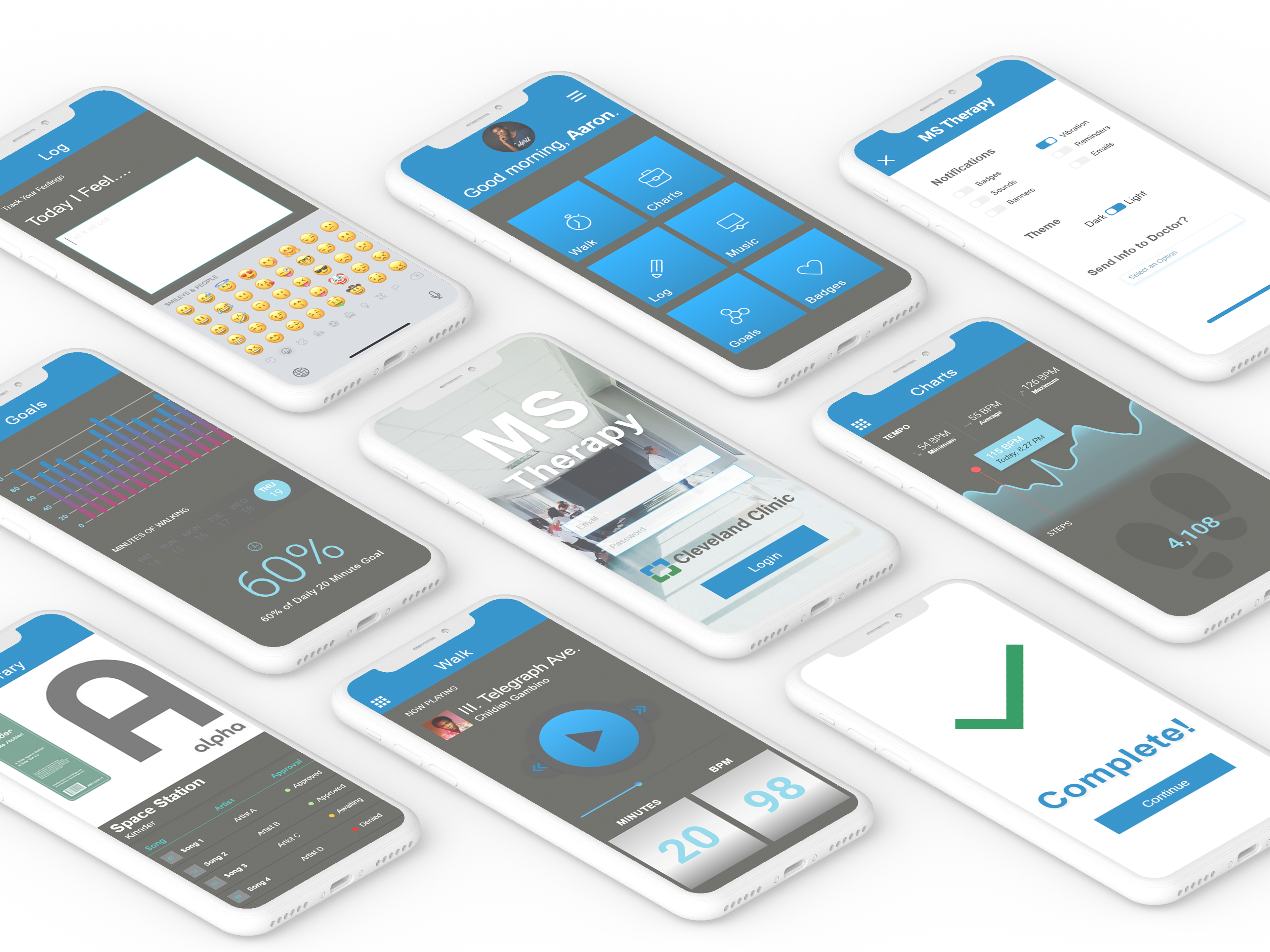
App home screen.
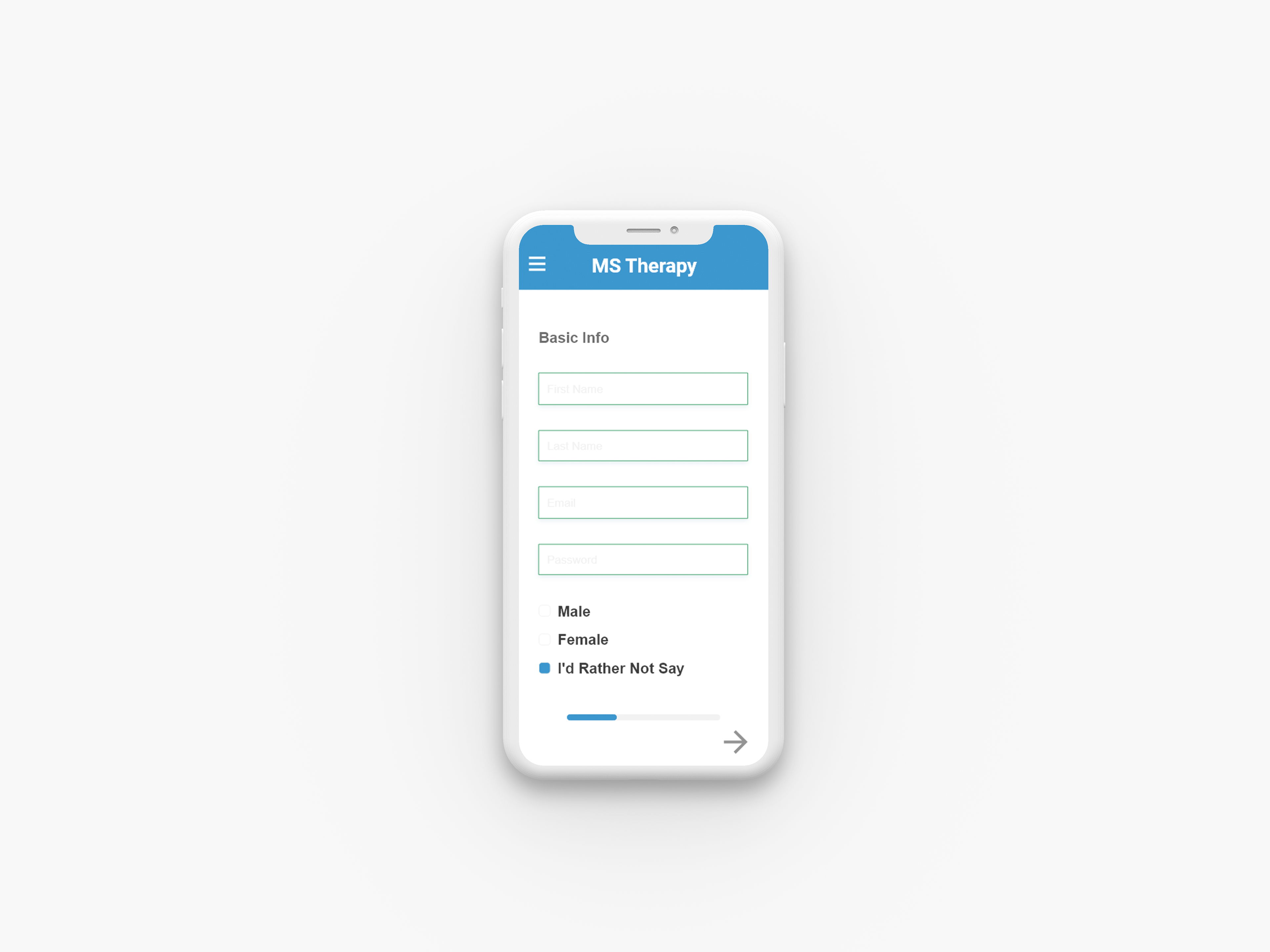
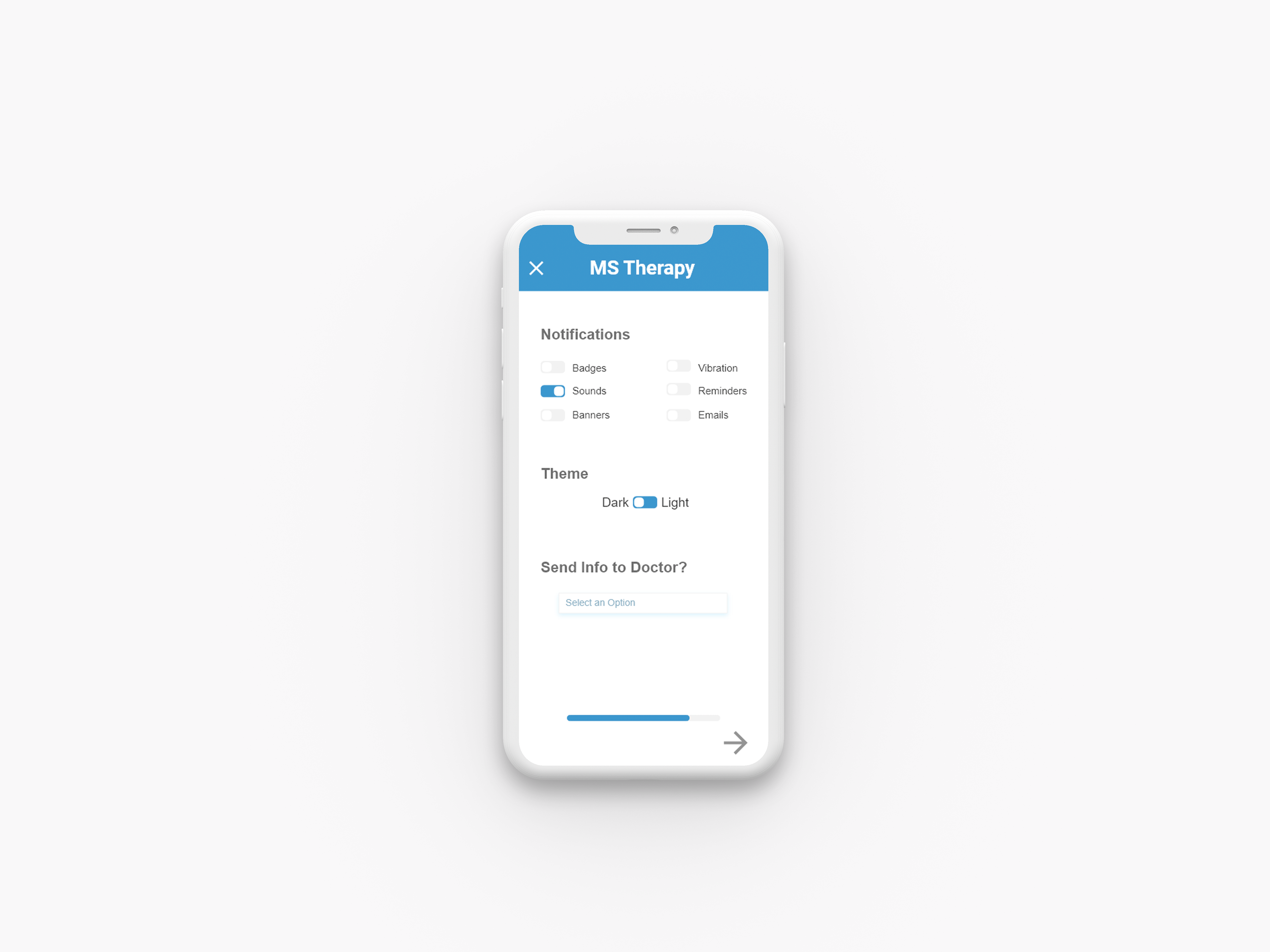
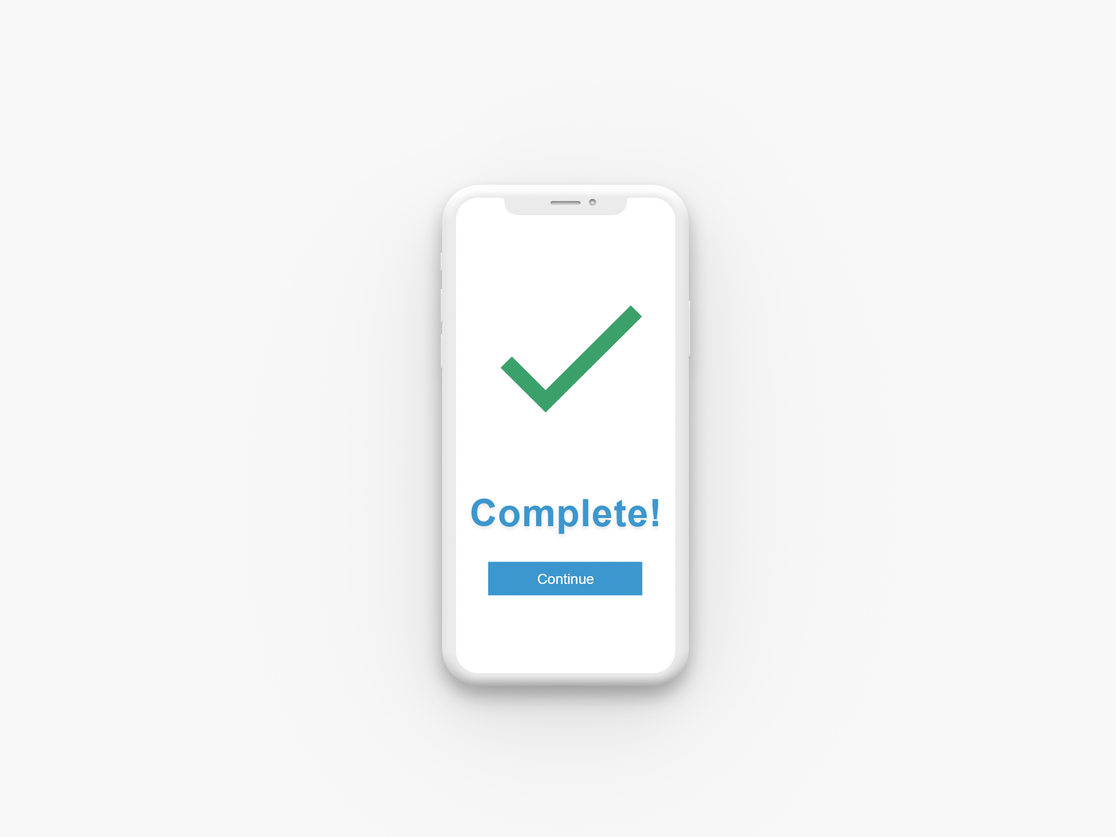
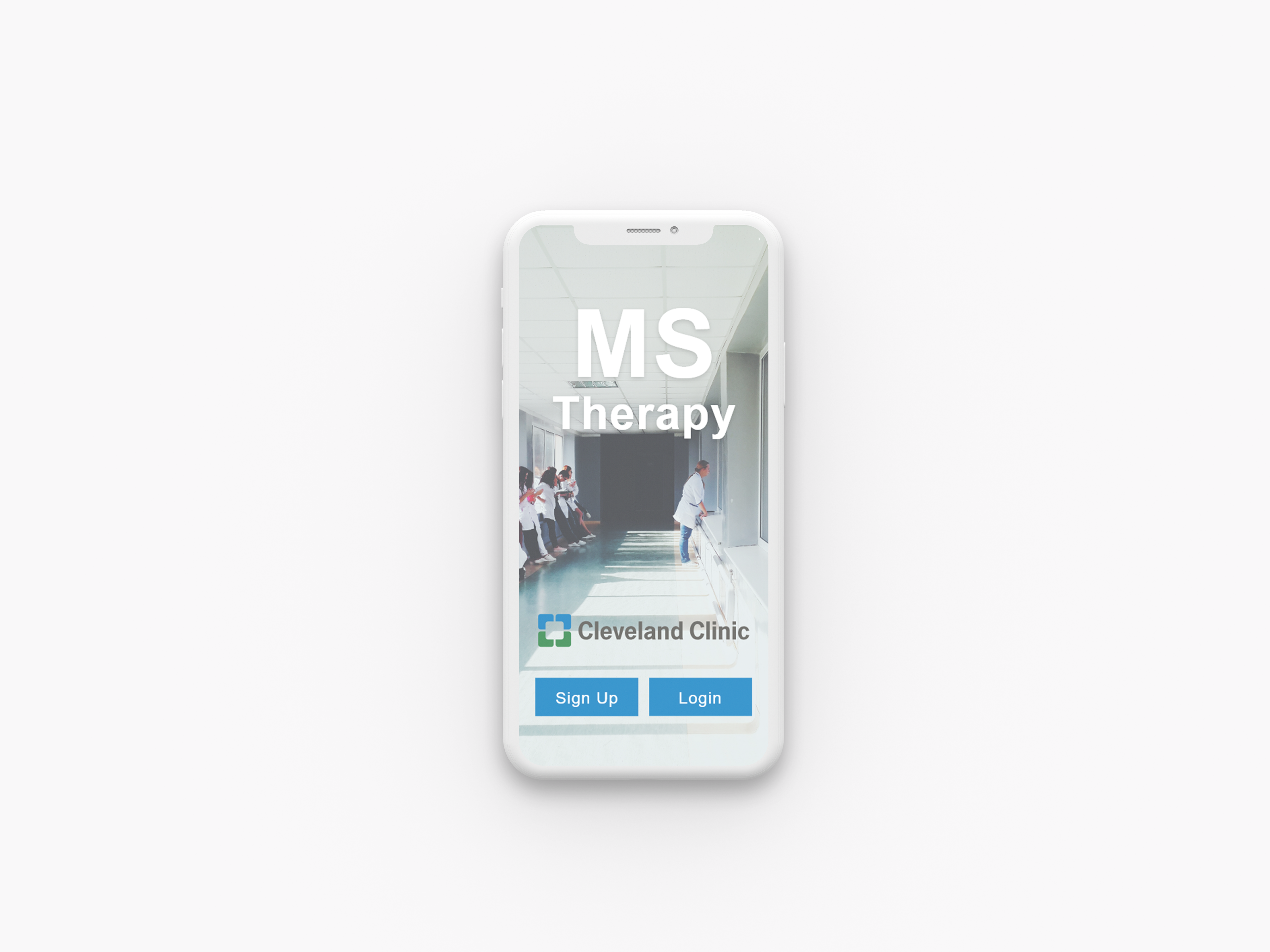
A simple three part onboarding process was a key focal point in the design and development of this app. I wanted to ensure that users don't feel frustrated or "not tech savvy enough" to use the product.
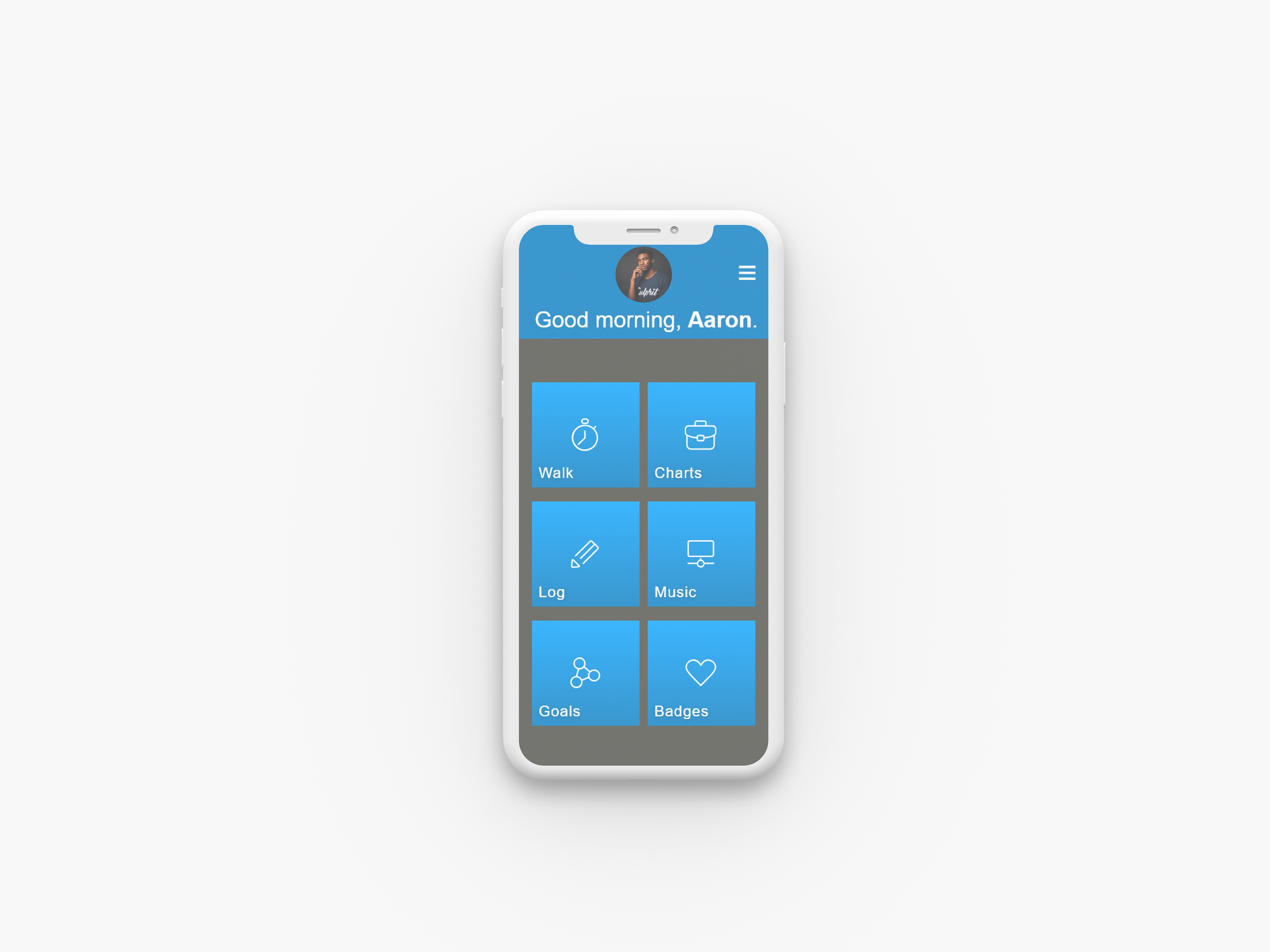
The main home screen, inspired by Microsoft's tile navigation system, is meant to be easy to read and uncluttered for patients who may struggle with dexterity, vision, or cognitive abilities.
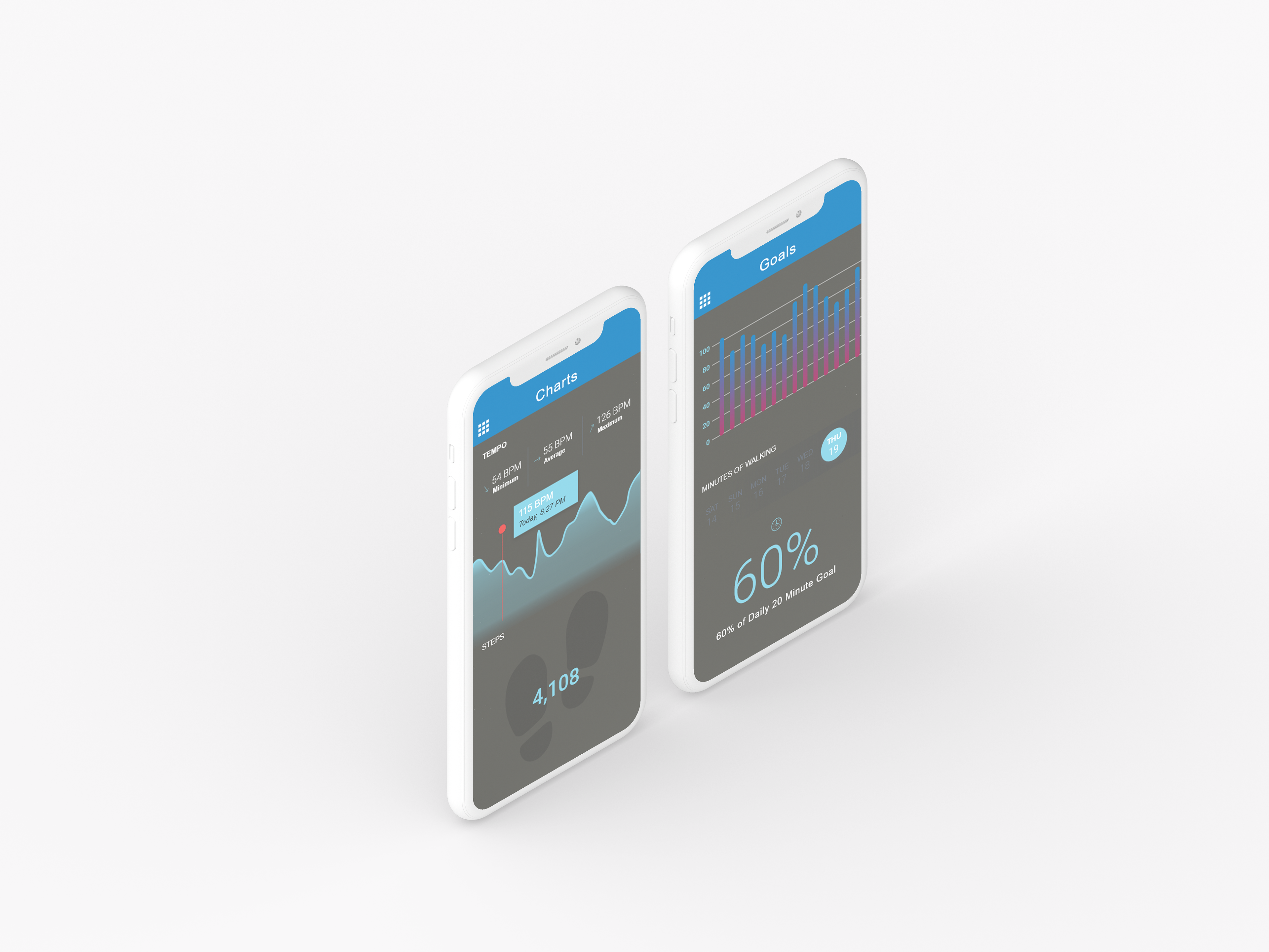
Inspired by commonly used fitness interfaces, the patient's progress is presented in a way that keeps them motivated while syncing with their doctor's data log to keep the patient connected without always needing a doctor visit.
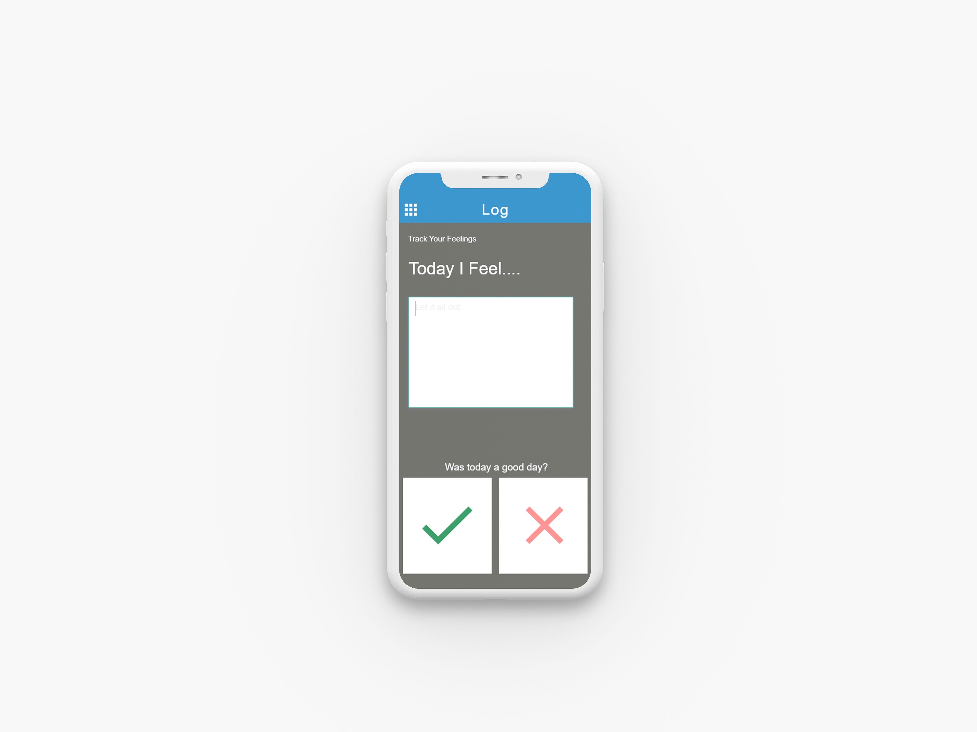
The patient's mental health and well-being plays a very large part in their physical therapy progress. A simple emotional log system allows them to engage with the app even on their "worst" days and based on privacy settings can be shared directly with the user's doctor. Keeping the user connected with their own progress can result in a more fulfilling patient experience.